How to choose a logo
Logos are one of the hardest parts of designing a website. It is usually our starting point, as it is influential to everything else down the line. When done right, a logo is just a part of the whole. When done poorly, a logo will effect every aspect of your business.
We also continually see online logo companies that sport increasingly lower costs for a logo, or logo competitions that allow designers to whip up something for you and throw in their hat to be chosen from hundreds. The inverse of that is that you are one of hundreds that they are currently working on, they know nothing about your business and are likely just recycling a logo they submitted last week.
As with everything in life, you get what you pay for.
When beginning a website redesign or branding, one of the first questions I ask is about the logo. The logo dictates the direction of the website layout which in turn dictates the content layout. The logo is created first and the remainder of the branding follows its lead. Because of this, its important to not corners on your logo. Nor does a logo have to be expensive. So what makes a logo a good logo? What should you be looking for when choosing a logo?

Types of Logos
There are 2 main styles you will see: font-based, iconic. Understanding these will help you understand which you need for your business.
Font-Based Logos
Font-based logos are just that: your name in a fancy or fitting font. They are usually the simplest and most cost-effective. That’s not to say they are not relevant or useful; sometimes simple is what works best. Examples of this are the Disney logo or the Facebook logo.
When choosing a font based logo, it’s important to keep the main characteristics of a good logo in mind (as discussed below), as this is where things can fail quickly. Choose a font with a thicker line so it stands out on transparent background. Handwriting fonts can be useful and stylish, but should be legible across all mediums.
Both the Disney logo and the Facebook logo started out as font based logos, but have become iconic logos. Both the “D” and the “F” can be used alone to represent the brand.
Iconic Logo
An iconic logo is an illustration or icon that in some way represents the brand or business. In some cases, such as in the case of Apple computers or Nike’s swoosh logo, the icon doesn’t seem to have any connection to the industry or business. It may be a random shape or a simplified version of something that no longer bears much connection to the original. Either way, you associate the brand with the icon in your mind’s eye.
Other iconic logos may be more literal, such as the silhouette of a dancer for a dance studio. This sort of icon is helpful when a viewer might not know offhand what the business does, whether this is because it is new or because the name doesn’t make it obvious. The icon supports the message.
Many logos are actually a combination of both font based and iconic, and both parts can be used together or independently. This helps with scalability, as you can choose which logo works best for which medium.

Guidelines for choosing a logo
Below are a few guidelines to keep in mind when choosing a logo.
Adaptability.
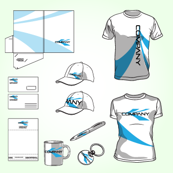
When choosing a logo, test it on many mediums and in many sizes. How does the logo look across all mediums such as business cards or a large storefront sign? Can you print it on T-Shirts? I frequently see logos that work great on websites, whether they have a nice background, gradient or too much detail. Take that same logo and put it on a banner and it is hard to read, looks messy and unfocused or at worst, requires awkward backgrounds and containing boxes.
A good logo should scale to all sizes or color schemes and should be simple enough to be adapted to all mediums without losing the message or idea it portrays.
Target Market
This one seems like it should be common sense. But it can be difficult to distinguish between what you like and what your target market likes. When designing a logo or anything for that matter, everyone comes to the table it with a picture in their head. Being able to get that picture out of your head and translated unto paper is a sign of a good designer. These design preconceptions should be analyzed and compared to good design practices as well as your target market.
Keep this in mind while choosing a color as well. Read up here about what the various colors represent.
Simple
Your logo needs to visually represent your brand with a quick glance (which is all the time you have). Resist the urge to overcomplicate the logo by adding every facet of your business into it. Yes, your logo should represent your business, but the reality is that most people don’t read into it what you will. Viewers see color, shape general theme. Beyond that, you have lost them. If you try to get too literal, you are likely to overcomplicate things. Err on the side of simplicity, as this will make the logo more memorable.


