Improving Your Website’s Usability
Is your website bringing in enough leads? If not, poor usability may be the culprit. Website usability is the way your content is organized, and how it funnels users to conversion. Here’s a few questions to ask yourself:
- Is your contact info easy to find?
- Does it feel cluttered or disorganized?
- Where does a user click to be converted into a lead?
A usable website leads to more income. When your potential clients feel comfortable browsing your website, they are more likely to stick around and find what they are looking for. When they feel satisfied and happy with what they have seen, they will take the time to make the purchase, fill out the contact form, or schedule an appointment. No matter your industry, when a person moves from browsing to interacting, you have created a new client. People will not spend time trying to navigate an unorganized and inhospitable website, even if you are the best at what you do.

Your Website Goals
The first thing you can do to improve your website’s usability is to decide what you want your client to do on your website. Will they buy a product? Make an appointment? Find information about hours or availability? Read an article or click a particular link?
Next you can decide how you will move your client to follow through with the desired action. Consider how you will catch their attention and how you will make it easy for them to follow through on the desired action.
Moving to Action
Once you have decided the goal, you want to move the user to action quickly, but not too aggressively. Most users on the internet are not likely to hang around a website for a very long time. Neilson Norman Group points out that the longer a person stays on the site, the longer they are likely to continue on that site. According to their data analysis, you have about 10 seconds to grab their attention. If they decide to stay after that 10 seconds, they are giving you a chance and may follow through with an action. Eye-catching design, clear information, and easy navigation, are all elements that will work together to help a potential client linger on your website.
Two things that will drive clients away are too much content or disorganized content on the landing page or being bombarded with calls to action. Too much content leaves the client feeling overwhelmed. If they do not know where to click to find the information they want, they will simply leave. Too many popups or demands to sign-up for accounts or register, before the client has become familiar with your business can be a turn-off causing your client to move on as well.

Thoughtful Design
In addition to making your site inviting, it needs to be intuitive. There are specific standards of practice in design that people always look for on a website. Small details like placement of links, menus, forms, and search bars, all add up to a friendly and inviting user experience. For example, users tend to look in the top right or the footer for contact information. Why make users work for your call-to-actions?
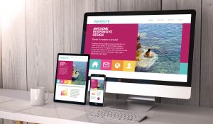
This is especially true when you consider mobile devices. According to Statista, mobile devices account for half of all website traffic. You don’t want to miss out on half of your potential clients because your website isn’t mobile friendly.
Work With A Professional Web Designer in Breckenridge CO
An experienced website designer will know how to arrange your website and feature your work so that clicks on your site become clients for your business. Call Tandem Design Lab today to find out how working with a professional web designer in Breckenridge can transform your website, and ultimately your business.


